CARA New York

2022
Pores for Center for Art, Research and Alliances

Visual identity is based on the concept of porosity and absorption. Together with CARA researchers and curators, the vibrant pores aim to expand public discourses and historical records to reflect art’s abundant pasts, presents, and futures. The hybrid relational logotype—full of breathable holes—has the capacity to challenge dominant narratives by facilitating knowledge about shifting mechanisms of oppression and the realities of racial capitalism. Shells and snails let us dream not only about ourselves but about each other, about beings of the forest, of water, of animals, of invisible beings—as porous interdependent entities reliant on each other and everything around.
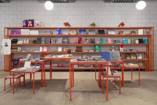
  • CARA New York: orange shelves and tables carry books and flowers along white brick, totes with vibrant pores hung above
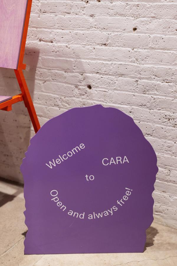
  • CARA New York: a purple shell-edged pore leans on white brick, letters curving 'Welcome to CARA, Open and always free!'
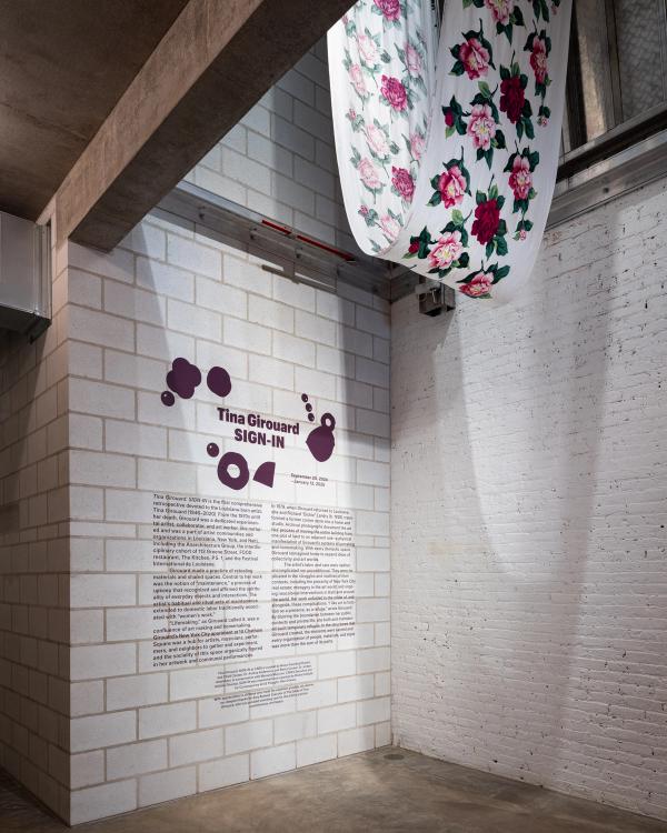
  • CARA New York: a text-heavy brick wall reads 'Tina Girouard SIGN-IN' among plum pores, rose-print cloth hung above
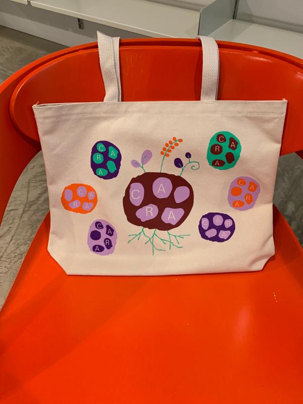
  • CARA New York: a cream tote sits on an orange chair, a maroon pore sprouting roots and shoots among six vibrant pores
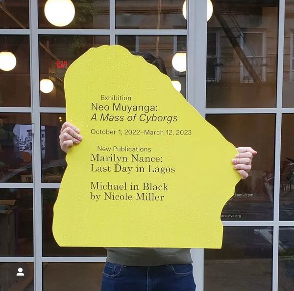
  • CARA New York: a figure lifts a yellow pore-cut sign at glass doors, hybrid type naming 'Neo Muyanga: A Mass of Cyborgs'
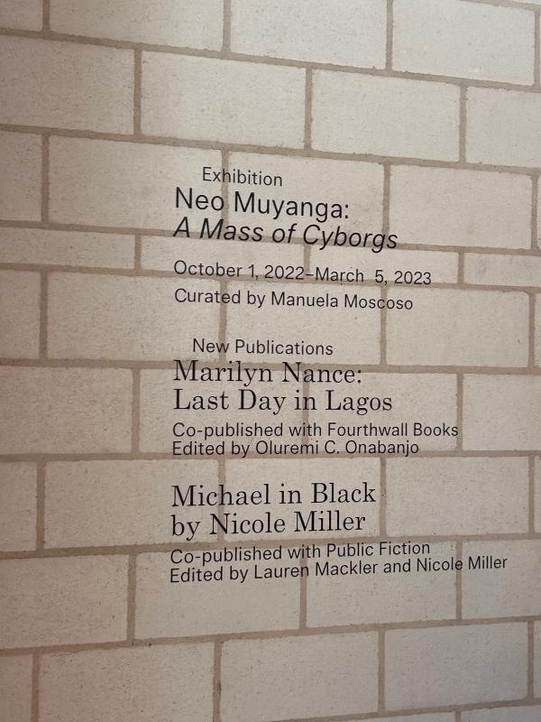
  • CARA New York: a text-heavy brick wall absorbs hybrid type, 'Neo Muyanga: A Mass of Cyborgs' above 'New Publications'
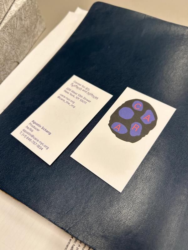
  • CARA New York: on navy leather a black pore with blue holes spells CARA, its twin card listing Research and Alliances
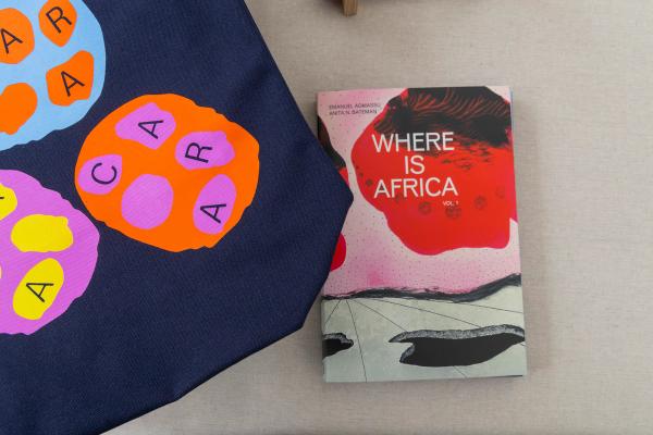
  • CARA New York: a navy tote wearing vibrant orange, blue and pink pores lies by the book 'Where Is Africa' on grey linen
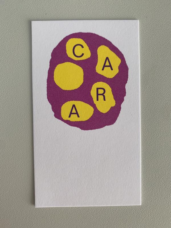
  • CARA New York: a white card carries a magenta pore with five yellow breathable holes, C A R A settling in four of them
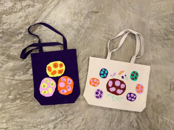
  • CARA New York: two totes lie on concrete, a purple one blooming three vibrant pores, a cream one rooting a maroon CARA