The Rodina
Studio
👁️
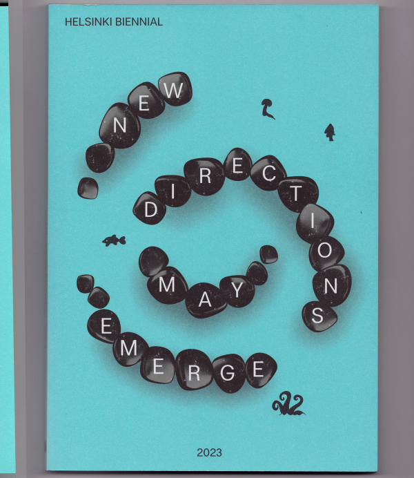
Helsinki Biennial 2023
Accidental Geopoetics
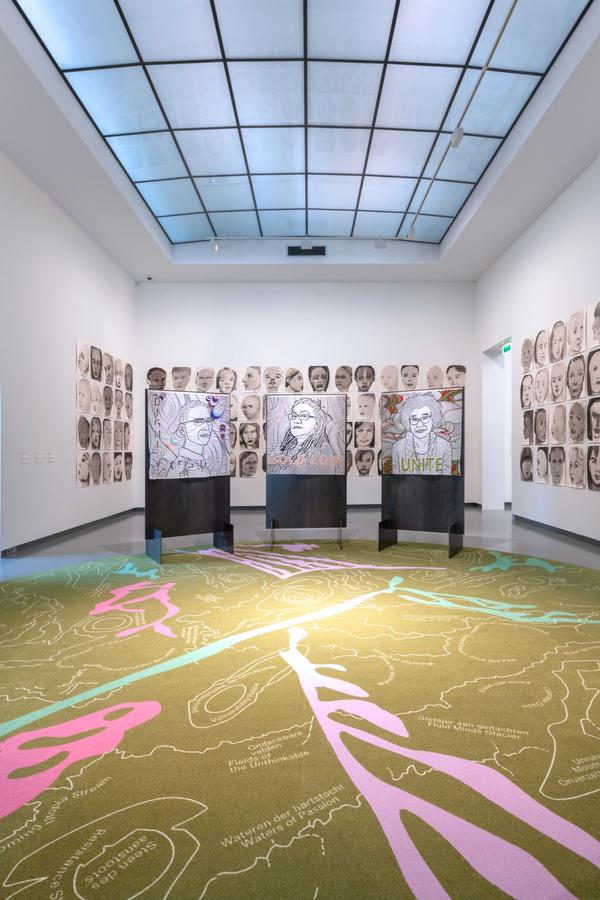
Delinking and Relinking
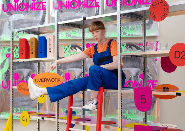
Unionize: Abolish the Stage of Precarity
Uncertainty Seminars
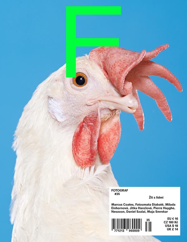
Fotograf Magazine
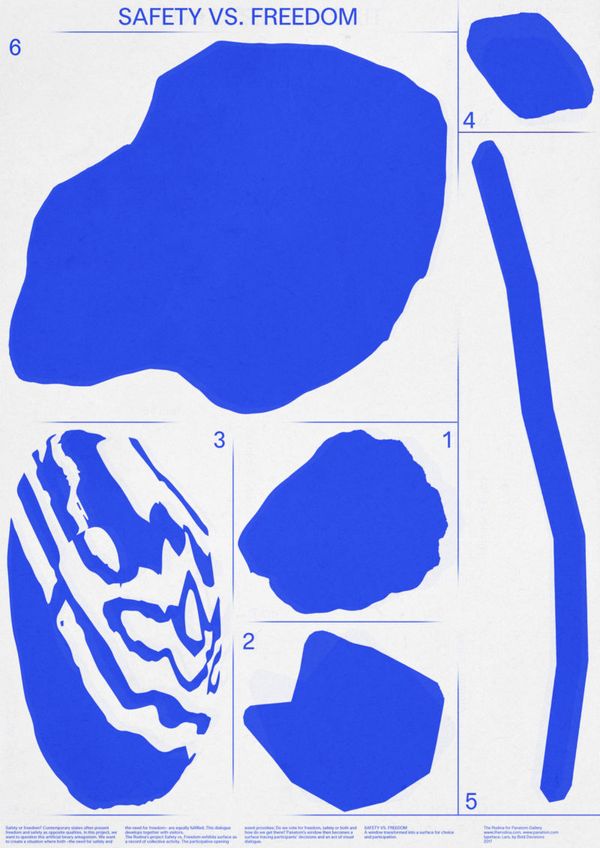
Freedom vs. Safety
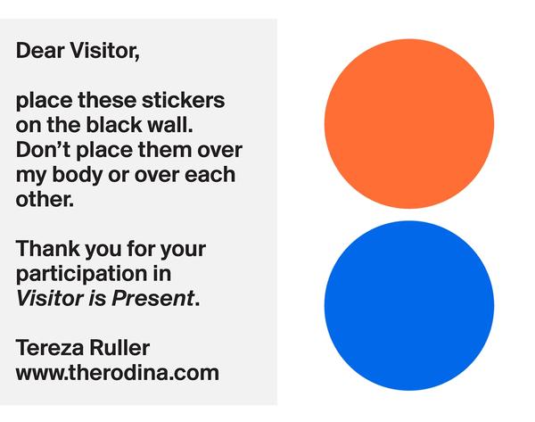
Visitor is Present
Spatial Affairs. Worlding
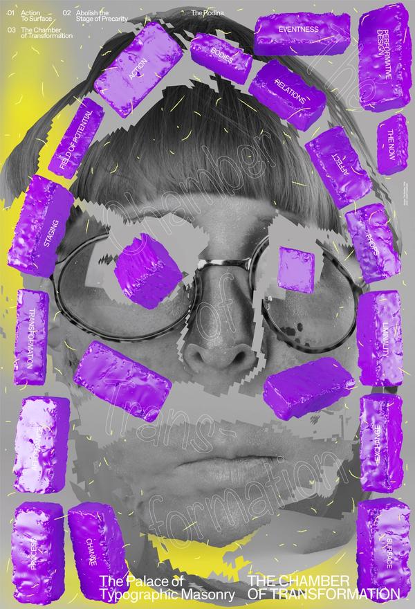
The Chamber of Transformation
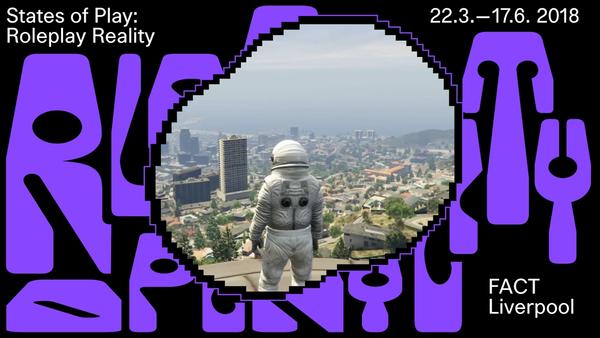
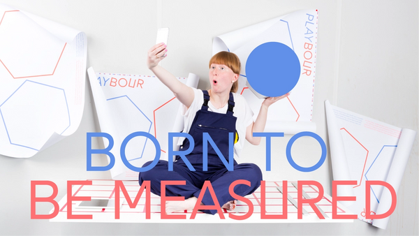
Playbour: Roleplay Reality
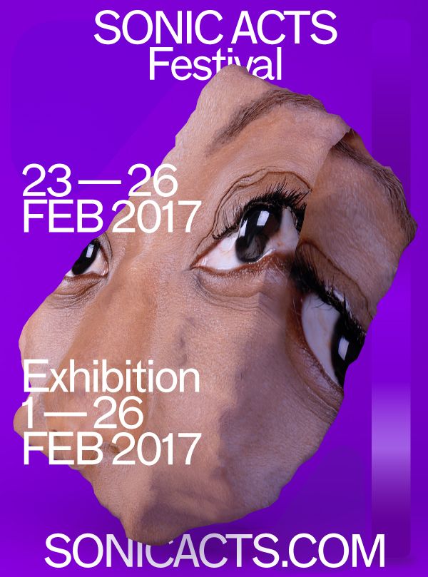
Sonic Acts Festival – The Noise of Being
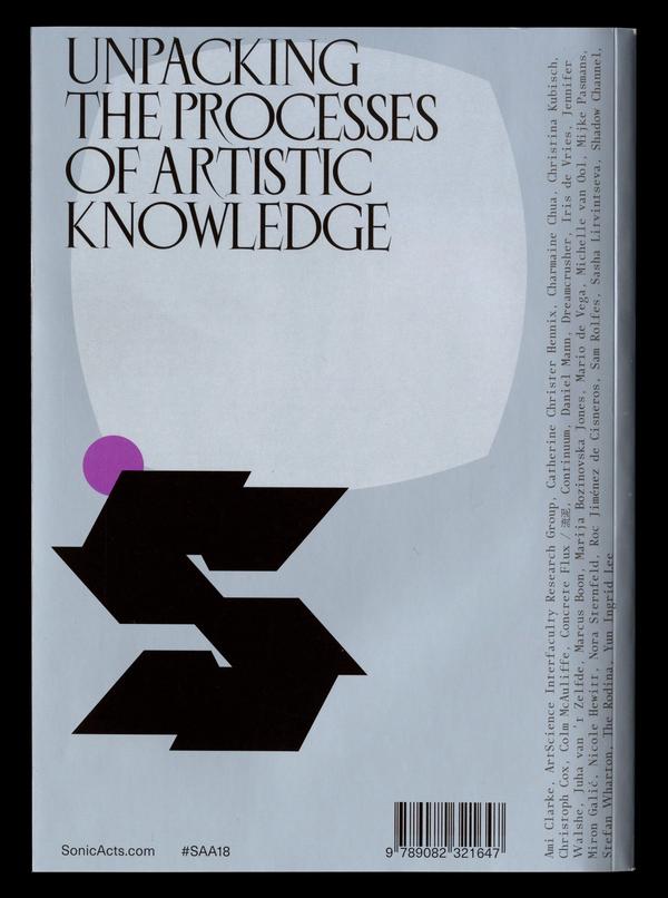
Sonic Acts Academy 2018: Unpacking the Processes of Artistic Knowledge
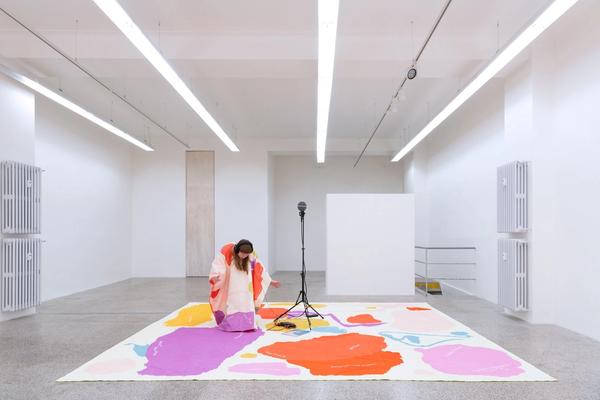
Parade
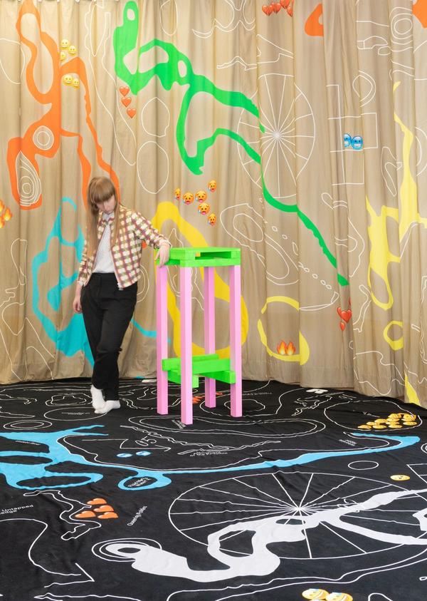
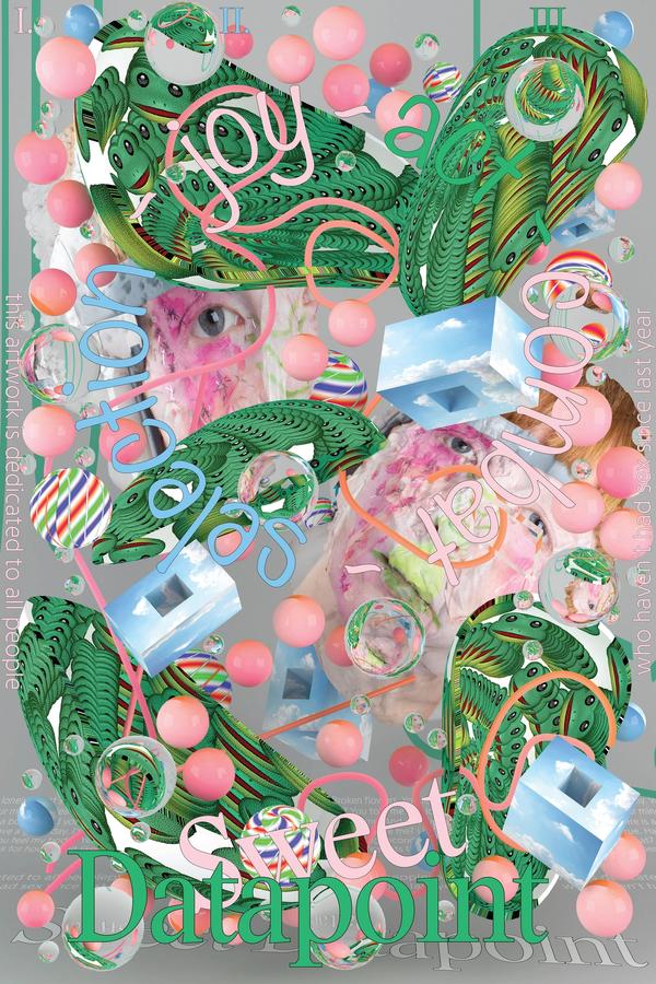
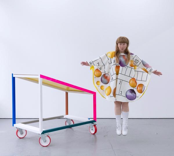
Sweet Datapoint
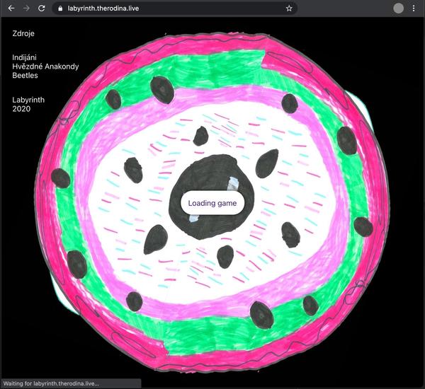
Resources
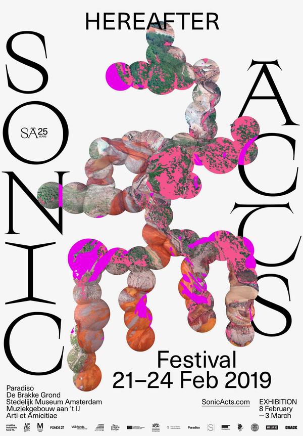
Sonic Acts Festival – Hereafter
Elements of Style
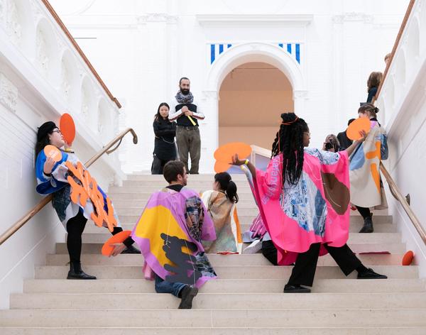
States of Play: Roleplay Reality
Putochinomaricón – 2 A.M.
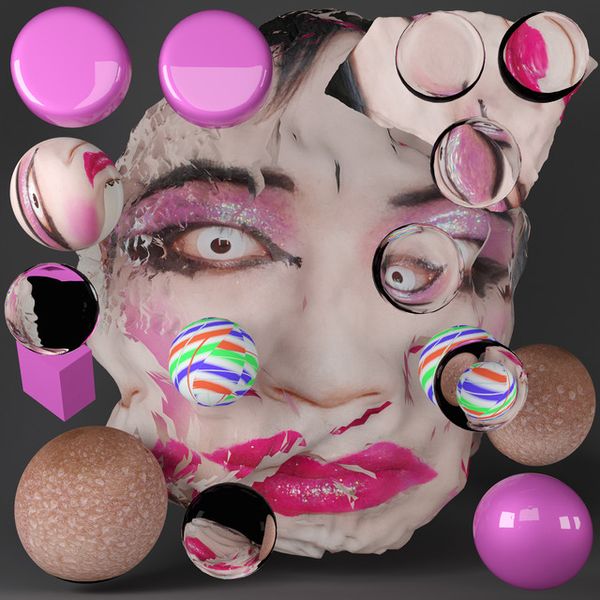
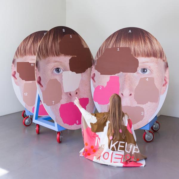
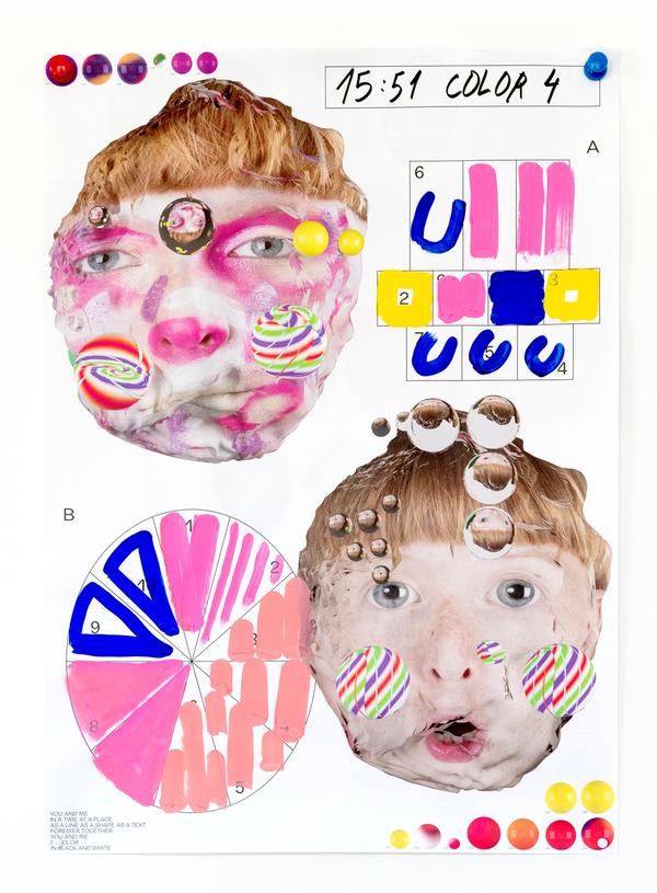
Mass Makeup: Freckles
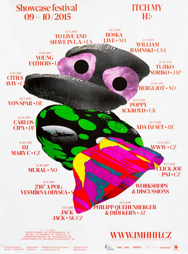
Itch my HAHAHA
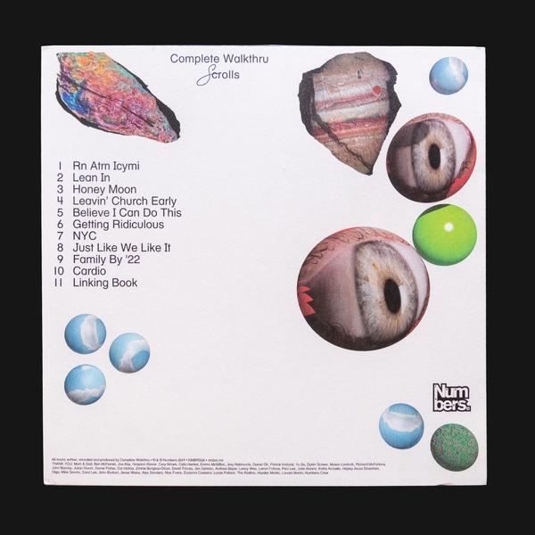
Scrolls
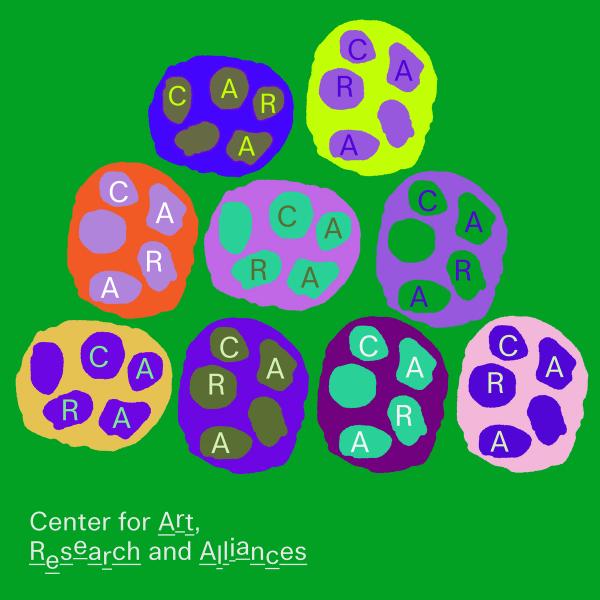
CARA New York
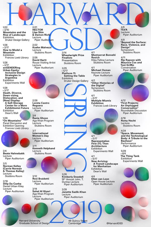
Harvard GSD Lecture Series
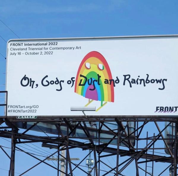
FRONT International: Oh Gods of Dust and Rainbows
Playbour: The New Workaholism
You and Me
Slow Signal – Carbon Performing Silicon
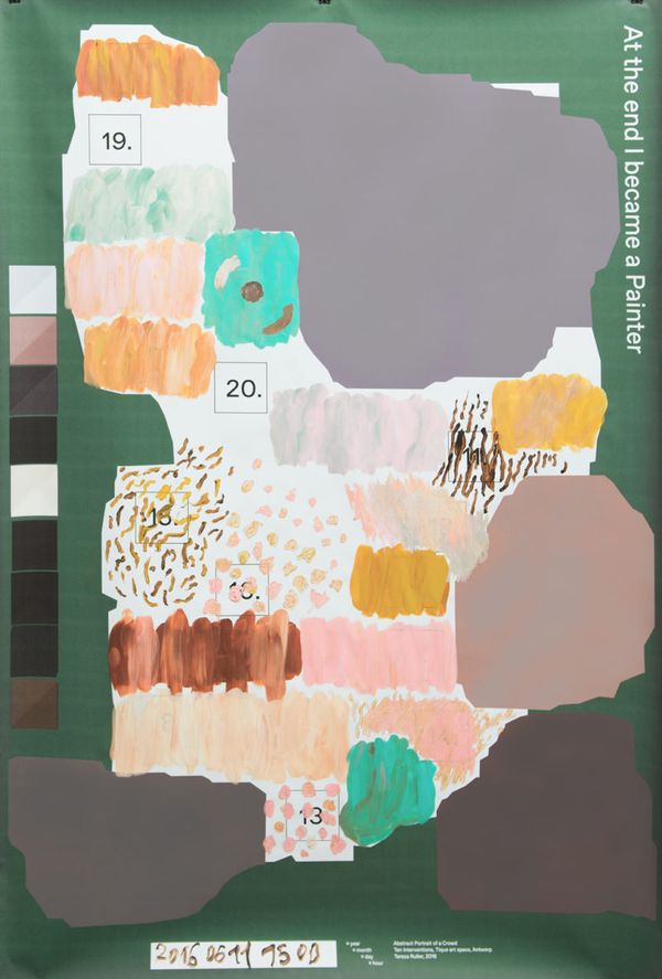
Abstract Portrait of the Crowd